
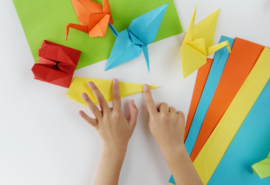
Are you a DIY enthusiast looking to create stunning pop-up cards? Avoiding common design mistakes is essential to achieving professional-looking results.
In this article, we will explore seven frequently made mistakes in DIY pop-up card design and provide expert tips on how to avoid them.
From overcomplicating the design to neglecting card balance, we'll cover all the crucial aspects that can make or break your card.
So, let's dive in and elevate your pop-up card game!
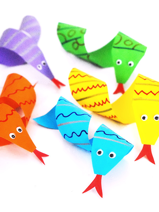
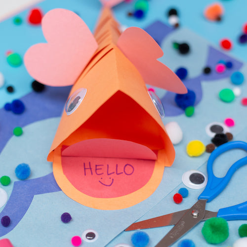
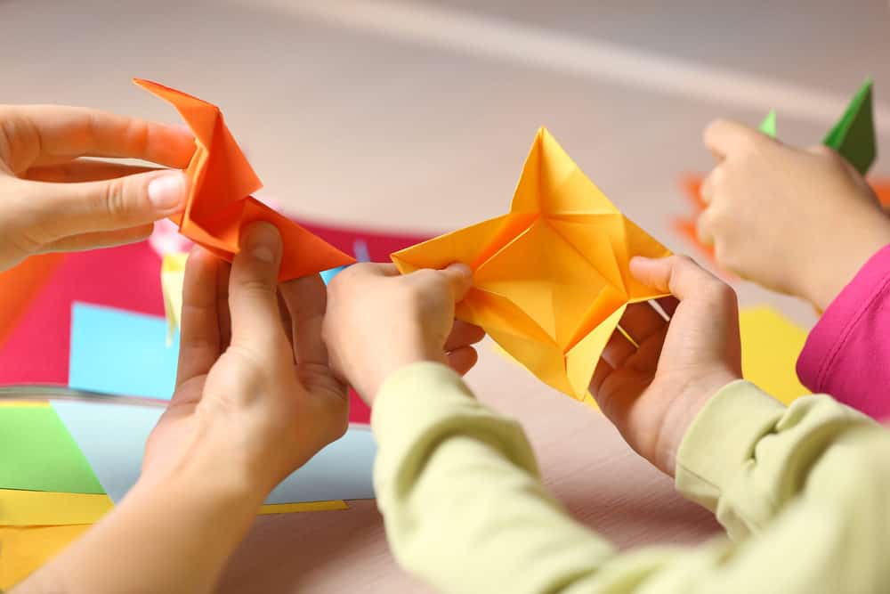
Overcomplicating the Design
The inclusion of excessive elements and intricate details can hinder the overall effectiveness and functionality of a DIY pop-up card design. When it comes to designing a pop-up card, simplicity is key.
Adopting a minimalist approach not only enhances the aesthetic appeal but also ensures that the card is easy to assemble and manipulate. Design simplicity allows for a clear and concise message to be conveyed, allowing the recipient to fully appreciate the sentiment behind the card.
By avoiding the temptation to overcrowd the card with unnecessary embellishments, the focus remains on the pop-up mechanism itself, resulting in a more impactful and visually pleasing design.

A minimalist approach also allows for more flexibility and creative freedom, as it encourages experimentation with different shapes and structures without compromising the overall design.
Choosing the Wrong Adhesive
Using the wrong adhesive can compromise the integrity and durability of a DIY pop-up card design. When it comes to adhesive types, it is essential to choose one that is strong enough to hold the various components of the card together, yet flexible enough to allow the card to open and close smoothly.
Common adhesive types used in pop-up card designs include double-sided tape, glue dots, and liquid glue. Double-sided tape is a popular choice as it provides a strong bond and is easy to use.
Glue dots are another option, offering a mess-free application and excellent adhesion. Liquid glue, although versatile, requires proper application techniques to prevent it from seeping through the cardstock and causing damage.
To ensure a successful pop-up card design, it is crucial to follow proper adhesive application techniques and choose the right adhesive for the job.
Incorrect Dimensions
When it comes to DIY pop-up card design, incorrect dimensions can have a significant impact on the final result. Size miscalculations may lead to cards that are either too small or too large, making them visually unappealing or difficult to handle.
Additionally, using the wrong card proportions or inaccurate folding techniques can disrupt the intended pop-up effect and undermine the overall design.
It is crucial to pay attention to the dimensions of your pop-up cards to ensure a successful and visually pleasing outcome.
Size Miscalculations
An accurate understanding of the correct dimensions is essential to avoid size miscalculations in DIY pop-up card design. Common mistakes and measuring errors often lead to cards that are either too big or too small, resulting in a disappointing final product.
When designing a pop-up card, it is crucial to take precise measurements of the base card, as well as the elements that will be popping up. Failure to do so can lead to misalignment and an unprofessional appearance.
To avoid size miscalculations, it is recommended to use a ruler or measuring tape and double-check all measurements before cutting or folding.
Additionally, referring to templates or tutorials can provide guidance on the correct dimensions for various pop-up card designs.
Wrong Card Proportions
With improper measurements and inaccurate calculations, designers often end up with pop-up cards that have wrong proportions and incorrect dimensions, resulting in a less visually appealing final product.
The dimensions of a pop-up card are crucial in determining its overall look and functionality. When the proportions are off, the card may not open or close properly, and the pop-up elements may not align correctly. To avoid this mistake, designers should carefully measure and calculate the dimensions of the card before starting the design process.
Additionally, creative alternatives can be explored to achieve the desired effect while maintaining the correct proportions. Proportional adjustments can be made to ensure that all elements of the card are visually balanced and harmonious.
Inaccurate Folding Techniques
Improperly executing folding techniques, particularly when it comes to dimensions, can lead to inaccuracies in the final design of a pop-up card. Fold accuracy is crucial in ensuring that the card pops up correctly and maintains its intended shape. Precision folding plays a significant role in achieving the desired visual impact of the card.
When the dimensions are incorrect, the card may not fold or unfold smoothly, resulting in a distorted or misshapen appearance. It is important to carefully measure and mark the folding lines to ensure accuracy and consistency throughout the design.
Taking the time to master the folding techniques and paying attention to the dimensions will greatly enhance the overall quality and professionalism of the pop-up card.
Neglecting to Check Card Balance
Often overlooked by DIY card designers, failing to check the balance of a pop-up card can lead to structural instability and poor functionality. Neglecting to consider card stability and weight distribution can result in a card that doesn't stand properly or collapses under its own weight.
Here are three important factors to keep in mind when checking the balance of your pop-up card:
Weight distribution: Ensure that the weight of the card is evenly distributed to prevent it from toppling over or leaning to one side.
Reinforcement: Consider reinforcing the areas where the card pops up to provide additional support and stability.
Test and adjust: After assembling the card, test its balance by gently pressing down on different areas. Make any necessary adjustments to ensure that the card stays upright and functions properly.
Spelling Mistakes
One common oversight in DIY pop-up card design is the occurrence of spelling mistakes. These errors can detract from the overall quality and professionalism of the card, and can even change the intended meaning of the message. To avoid spelling mistakes, it is important to pay attention to detail and proofread your card thoroughly before finalizing it.
Here are some common errors to watch out for and some proofreading tips to help you catch and correct any spelling mistakes:
Homophones: Words that sound the same but have different meanings and spellings, such as 'their' and 'there.' Make sure you are using the correct word in your card.
Typos: Simple mistakes like typing 'poeple' instead of 'people' can easily go unnoticed, so make sure to double-check your spelling.
Unfamiliar words: If you are using words that you are not familiar with, make sure to consult a dictionary to ensure correct spelling.

To proofread effectively, read your card slowly and carefully, checking each word for accuracy. It can also be helpful to read your card out loud, as this can help you catch any spelling mistakes that you may have missed when reading silently.
Clashing Color Schemes
When it comes to designing DIY pop-up cards, color harmony is of utmost importance. Clashing color schemes can easily ruin the overall aesthetic and impact of your card.
To avoid color clashes, it is crucial to carefully select and combine colors that complement each other, creating a visually pleasing and cohesive design.
Color Harmony Importance
A well-designed pop-up card incorporates color harmony to avoid clashing color schemes and create a visually appealing final product. Color harmony plays a significant role in the overall impact of a pop-up card, as it can elicit specific emotions and set the tone for the recipient's experience.
When choosing colors for your pop-up card, keep the following points in mind:
Color psychology impact: Different colors evoke different emotions and have varying psychological effects. Consider the message you want to convey and select colors that align with that sentiment.
Choosing complementary colors: Opt for colors that complement each other, creating a harmonious and balanced look. Experiment with color wheels or online tools to find complementary shades.
Balancing warm and cool tones: Incorporating a mix of warm and cool tones can add depth and interest to your pop-up card design.
Avoiding Color Clashes
To prevent color clashes and achieve a harmonious color scheme, it is crucial to carefully consider the combination and contrast of colors in your DIY pop-up card design.
Color theory plays a significant role in understanding how different colors interact with each other and create visual impact.
One effective strategy is to use complementary colors, which are located opposite each other on the color wheel. These combinations create a strong contrast that can make your pop-up card design visually appealing and dynamic. For example, pairing blue with orange or red with green can create a striking effect.
However, it is important to use these colors in moderation to avoid overwhelming the viewer.
Rushed Designing
One common mistake in DIY pop-up card design is hastily creating the design without giving it sufficient time and attention. Rushed designing often leads to overlooking details and a lack of creativity in the final product. To avoid this, take the time to carefully plan and sketch out your design before starting the actual construction.
Consider the following tips to ensure a well-designed pop-up card:
Start with a clear concept: Take the time to brainstorm and come up with a unique and meaningful idea for your card.
Pay attention to small details: Even the smallest details can make a big difference in the overall design. Take care when cutting and folding the paper, and make sure everything is aligned properly.
Experiment with different techniques: Don't be afraid to try new techniques and explore different materials. This will help add creativity and uniqueness to your design.
Frequently Asked Questions
What Are Some Examples of Overcomplicating the Design in a DIY Pop-Up Card?
Overcomplicating the design in a DIY pop-up card can include using too many moving parts, intricate cutouts, or complex mechanisms. Simplifying pop-up card designs can help avoid common mistakes in pop-up card engineering.
How Can I Choose the Right Adhesive for My Pop-Up Card Design?
Choosing the right adhesive for your pop-up card design is crucial in ensuring a successful and long-lasting result. Common mistakes when selecting adhesive for pop-up cards include using the wrong type, not considering the weight and flexibility of the materials, and not allowing enough time for the adhesive to dry properly.
What Are the Consequences of Using Incorrect Dimensions in a Pop-Up Card?
Using incorrect dimensions in a pop-up card can result in a lack of structural integrity, making the card unstable and prone to collapsing. It can also affect the overall aesthetic appeal and functionality of the design.
Why Is It Important to Check the Card Balance When Designing a Pop-Up Card?
Checking the card balance is crucial in designing a pop-up card as it ensures that the interactive elements function properly. Proper folding techniques and incorporating interactive elements are essential for an engaging and successful pop-up card design.
How Can I Avoid Spelling Mistakes and Ensure the Text in My Pop-Up Card Is Error-Free?
To avoid spelling mistakes and ensure error-free text in a pop-up card, proofreading is essential. Pay attention to commonly misspelled words, use spell-check tools, and have someone else review your work for accuracy.
 Kids Art ProjectsParty PlanningPaper CraftsOrigami for KidsPrivacy PolicyTerms And Conditions
